
For years, I feel I have failed to really convey the depth and breadth of my experience through my resume. It’s gone through so may rewrites, critiqued by colleagues and been tweaked endlessly. I don’t think I’m alone.
How do you do justice to something as complex as a career the same way we’d record the minutes for a long boring meeting? There has to be a better way.
We do this in our day to day jobs when we portray complex data in graph or dashboard form. A six month long project will be represented by a Gantt chart. What is our career but the longest, most ambitious and personally consequential project any of us will ever undertake? Why not try to use the tools we pick up in our careers, to showcase our skills?
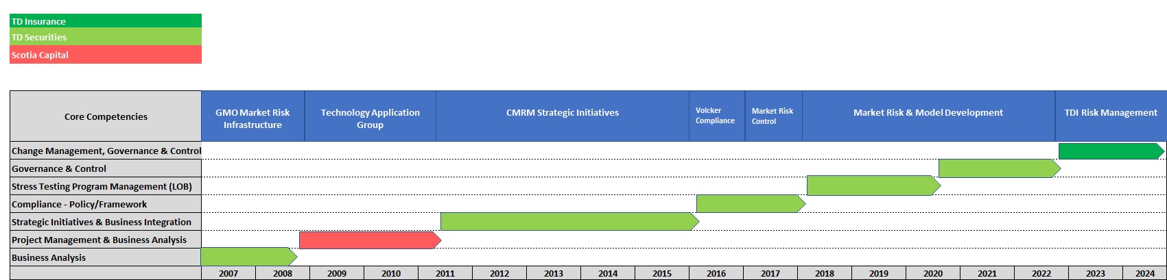
Well a good friend of mine had this Eureka moment a few months ago and he kindly shared it with me. Now I’d like to pass it along. Here is a chart showing my career progression of the last decade and a half with two of Canada’s major banks. The core competencies/skills that I mastered in each role are on the left column and the groups I worked in are on the top row. It shows the steady progression I have made, as each role built on the experience gained in the last.
This way of visualizing our career history is a useful compliment to the traditional resume. A resume is basically trying to tell the story of our careers. As any good story teller knows, the best way to do that is to show, not tell. And really that’s what this website is about, and I hope I can pass on something of value to my readers along the way.
